
Distributional accounts for households enable measurement, study developments, and identify drivers of inequality. Distributional information on households’ wealth is available from the Household Finance and Consumption Survey every three years since 2009/2010, while aggregates for the entire household sector are available quarterly from National Accounts. Our work focuses on developing a model-based approach to reconcile micro and macro statistics and to derive quarterly distributional household wealth which are consistent with macroeconomic aggregates. We find an increase in inequality, measured by the net wealth Gini coefficient, for most euro area countries from 2009 to 2020; that the 1% richest euro area households hold 28% of total net wealth, while the bottom 50% hold 4%; and that the net wealth of the top 1% has grown by almost 50%, compared to 28% for the remaining 99%.
Policymakers have repeatedly emphasised the need for granular household distributional information, as highlighted, for example, by the G-20 Data Gaps Initiative (International Monetary Fund, 2022), which was initially launched in 2009. Such distributional information would facilitate granular analyses to better understand the economic dynamics of the household sector and the effect of policies and regulations on wealth inequality.
Distributional accounts are commonly derived from micro-economic survey data that are matched with macroeconomic aggregates. Distributional national wealth (DNW) is based on the Household Finance and Consumption Survey (HFCS)1, for which three surveys were conducted during the period 2009-18, providing information on the assets, liabilities, income, and consumption of households of all euro area Member States. To derive DNW, the HFCS is matched with national accounts (NtlA) statistics2, which provide quarterly aggregates of indicators from financial accounts and non-financial assets.
Linking individual wealth components from the two sources one by one commonly reveals substantial discrepancies between the HFCS totals and the NtlA aggregates. Building on that linking process, a novel model is applied at country level to construct micro-economic time series for distributional accounts that match the quarterly NtlA aggregates and address shortcomings in the survey data. The combination of the derived euro area countries’ DNW also enables the construction of euro area DNW.
First, the linking of the HFCS to quarterly NtlA data is improved by comparing the time frame of the survey to the end quarter dates of the NtlA. Furthermore, the concepts of non-financial assets in NtlA and in the HFCS are aligned via an estimation due to the scarce availability of household data for those assets.
Related literature has shown that wealthy households are less likely to be covered by survey data (including the HFCS), resulting in a severe underestimation of the upper tail of the wealth distribution (and likewise inequality). To capture the missing wealthy, following (Vermeulen, 2018) a Pareto distribution is fitted to the upper tail of the net wealth distribution enhanced with publicly available “rich lists”, i.e. lists of the richest households.3 The fitted Pareto distribution allows to impute missing wealthy households via inverse transform sampling. The resulting population is then matched with the NtlA population.
While these adjustments eliminate some of the discrepancies between the HFCS and NtlA based on identified issues, some differences remain. A proportional allocation is applied to reconcile the adjusted micro data with NtlA aggregates. This provides three waves of reconciled country and euro area DNW for the period 2009-18.
In the final step, given the strong need for more frequent and more recent time series for the analysis of developments over time, and taking advantage of the information available from quarterly sector accounts, quarterly time series are constructed via an inter- and extrapolation model (based on a linear interpolation of asset and liabilities holdings at the net wealth quintile level and for the extrapolation under the assumption of a stable distribution of holdings of individual instruments). This approach, however, does not leave the wealth distributions constant: depending on the participation rates of households in various instruments, the portfolio composition, and the different developments of those instruments as measured in the NtlA (i.e. transactions by households and price changes over time), the wealth shares of household groups change, and lead to changes in the composition of each net wealth decile.
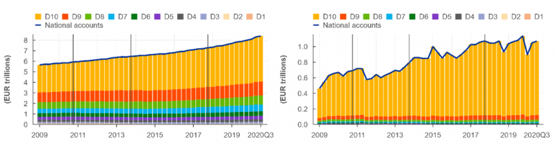
The analysis of holdings of individual instruments over time allows to better understand developments observed in the NtlA. For example, while deposits showed a relatively constant increase in the last decade, benefiting several net wealth deciles, the ups and downs of holdings of listed shares mainly affected the top of the wealth distribution, and contributed to a significant increase of their wealth over this period, while the effect was very limited for the rest of the population.
Figure 1: Euro area household holdings of Deposits (left) and Listed Shares (right).
The derived country and euro area DNW enable a detailed analysis of the development of inequality and wealth structures over time in a consistent NtlA framework.
A first overview of the most common inequality indicators is provided in Table 1 for 2020 Q3 for the large euro area economies, as well as for the euro area aggregate. Overall, about 8.25 million households in the euro area (which is approximately 5.40% of the population) have a net wealth over EUR 1 million. The subset of those wealthy households that belong to the top 1% owns approximately 28% of the total net wealth of the euro area household sector. The sizable disproportion of the distribution of net wealth is further highlighted by the top 10%, which owns 58% of the total net wealth, while the bottom 50% jointly only owns less the 4%.
Table 1: Inequality indicators on household level for selected euro area countries and the euro area aggregate for 2020 Q3.
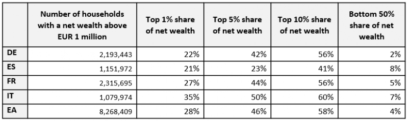
Note: For example, the top 1% contains the richest 1% of the country’s households in terms of net wealth.
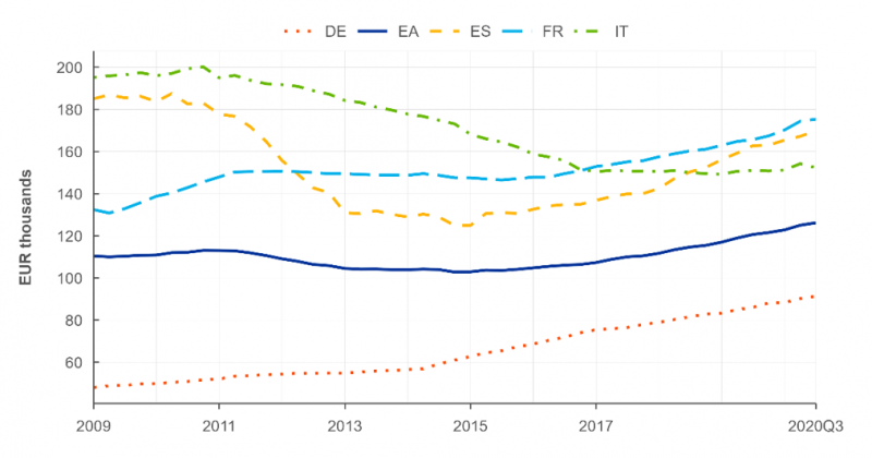
A measure that everyone can easily relate to and that offers a first insight into the distribution and development of net wealth is the median net wealth per capita, as shown in Figure 2. The median net wealth per capita of the euro area increases from EUR 45,000 in 2009 Q1 to EUR 52,360 in 2020 Q3, with the growth occurring predominantly since 2017. Both the median net wealth per capita and the growth rates can be seen to vary across several euro area economies over the last decade.
Figure 2: Median net wealth per capita from 2009 Q1 to 2020Q3. Note: The vertical axes display different ranges.
One of the most well-known inequality measures is the Gini coefficient, which is based on the Lorenz curve and bound by 0 and 1, where a value of 0 is achieved for perfect equality and a value of 1 in the case of perfect inequality. The development of the net wealth per capita Gini coefficients from 2009 Q1 to 2020 Q3 is shown in Figure 3. Overall, we can see that inequality increased in the euro area, even though some of the large European economies experienced a decline in net wealth inequality.
Figure 3: Development of the net wealth per capita Gini coefficients (following the definition of (Raffinetti, 2015)) for large euro area countries and the euro area (EA) aggregate from 2009 Q1 to 2020Q3.
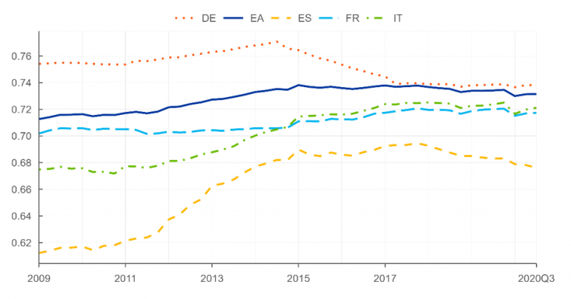
The Gini coefficients of the reconciled DNW corroborate findings of related literature. We see that the euro area Gini coefficient increases from 0.71 in 2009 to 0.74 in 2015 and afterwards slightly decreased to 0.73 in 2020.
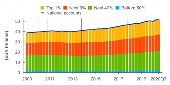
Figure 4 shows an overview of the evolution of the different net wealth percentiles for the period from 2009 Q1 to 2020 Q3. While the total net wealth of the euro area economy, represented by the blue line, has increased by around 34%, the net wealth of the bottom 99% has increased by only around 28%; the group with the worst performance within the bottom 99% was the bottom half of the distribution, with an increase of only around 20%. In the meantime, the net wealth of the top 1% of the distribution has increased by almost 50%.
Figure 4: Net wealth of euro area households.
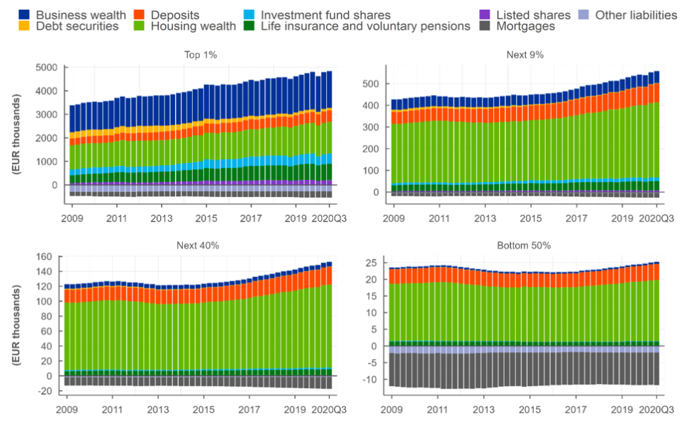
Furthermore, we find evidence that this development is largely attributable to the differences in the portfolio composition of different net wealth percentiles. While the portfolios of wealthy individuals are composed mainly of equity, which have risen over the last decade, the portfolios of individuals from the middle and bottom of the distribution are dominated by housing wealth and deposits, together with high leverage as shown in Figure 5.4
Figure 5: Portfolio composition of an average person, belonging to different net wealth percentiles, in the euro area.
The proposed method derives a granular quarterly micro data set that is in line with NtlA aggregates and enables a detailed analysis of net wealth distributions, including the portfolio composition, the development over time, and the evolution of inequality indicators. In addition, a first set of insights is provided.
First, our results corroborate the general perception and findings of related literature regarding a high level of inequality.
Second, to gain further insight into these findings, the composition of wealth at different percentiles is subsequently analysed. We find that over the last decade the top 1% of households increased their net wealth by almost 50%, while the remaining 99% of households saw only a 28% increase in net wealth. The net wealth of the bottom 50% increased by only 20%. Overall, housing is the largest asset group held by the household sector, representing around 50% of their total assets. A further analysis of the portfolio composition of individuals in different net wealth percentiles reveals that the observed disparity of net wealth can be explained by differences in investment behaviour. The portfolio of the richest 1% is dominated by equity investments (e.g., business wealth, investment fund shares, listed shares). Moving towards the lower percentiles, the portfolio instead becomes dominated by deposits and housing wealth, while at the same time being increasingly leveraged with mortgages. Within the bottom 50% of individuals, financial assets other than deposits are almost entirely absent.
European Central Bank. (2022). HFCS. Retrieved from https://www.ecb.europa.eu/stats/ecb_surveys/hfcs/html/index.en.html
International Monetary Fund. (2022). G20 Data Gaps Initiative. Retrieved from https://www.imf.org/en/Publications/SPROLLs/G20-Data-Gaps-Initiative#sort=%40imfdate%20descending
Mille, R. (2022). Forbes World’s Billionaires List. Retrieved from https://www.forbes.com/billionaires/
Raffinetti, E. a. (2015). On the Gini coefficient normalization when attributes with negative values are considered. Statistical Methods and Applications, 507- 521.
Statistical Data Warehouse. (2022). Quarterly Sector Accounts. Retrieved from https://sdw.ecb.europa.eu/browseExplanation.do?node=9689710
Vermeulen, P. (2018). How fat is the top tail of the wealth distribution? Review of Income and Wealth, 357-387.
The database can be accessed from (European Central Bank, 2022)
Macro data is accessible from (Statistical Data Warehouse, 2022)
A common example of such list is Forbes World’s Billionaires List (Mille, 2022)
It should be noticed that the top 1% of the wealth distribution contains a large portion of households from rich lists, and therefore, the observed portfolio partially reflects some of the assumptions taken when complementing the survey data.